| 🔍 > Lean Terms Directory |
Pareto Chart
The Pareto Principle, also known as the 80/20 rule, comes from observations made by a 19th century Italian economist named Vilfredo Pareto. It simply says that just a small number of causes (the critical few), determines the majority of the effects. For example, several difficult clients might take up most of a customer service rep’s time or a handful of purchasers might buy the bulk of a company’s products.
NOTE: Pareto’s original observation and mathematical proof was related to the bulk of wealth in Italy being owned by relatively few people.
Pareto charts are frequently used in continuous improvement. These charts are essentially bar charts that sequence the categories in descending order. On occasion, a chart will also show a line for the cumulative percentage.


Pareto charts are extremely powerful tools and they are an integral part of the problem-solving process. Pareto charts simplify data and help a team easily identify patterns and problems. Once you are able to identify what problem is taking up the majority of your resources, you can then narrow your improvement efforts to find focused solutions—ones that have significant impact. In essence, they help you get the most bang for your buck.
There is a good reason that Pareto charts are so popular. You don’t need an extensive background in math to understand them. And if you have a good teacher you can quickly learn how to create them and put them into practice to make your life easier at work. Most importantly, they are straightforward and carry visual impact. Bottom line: if you use them, they can make a big difference in your job.
Take a look at the three Pareto charts that follow. The first is titled “GoKart Defects (#), March”. This essentially shows how many of each incident occurred during the month. This might be useful if the intent is to strengthen the brand and prevent any defects from affecting customers.

If, however, your intent was to reduce the costs of defects, the second chart, “GoKart Defects, ($ to fix), March” might be better. Notice how the sequence changes when the chart is sorted by dollars to repair instead of quantity? This would be because electrical issues are very expensive to fix, and paint issues often require just a small touch-up job.

Each of the bars on the charts above could be further broken down. The following chart shows how a problem (paint) from the first chart can be looked at in more detail.

![]()

The most important thing to remember about a Pareto chart is that you have to know what you want to change. For example, you might be working on improving quality. Does that mean lowering the total number of problems, reducing the cost it takes to correct a single problem, or perhaps minimizing the number of “down-days” where a customer is without a piece of equipment? The order of the categories on your chart can change, sometimes dramatically, when you sort the data by different criteria.
Some potential pitfalls when creating a chart include:
- Using poor data. Make sure that the data you use is relevant to the problem you are facing. For example, you might be tempted to use existing data rather than spend the time on a new data collection This recycled data frequently isn’t quite what you need, but it is readily available. It often tempts teams to change their questions to match what the existing data can tell them. Or the business might have changed, so the old numbers no longer match reality.
- Using different collection periods for each category. It is best to collect data for all the categories at the same time. That keeps periodic variations (i.e. seasonality or vacations) from influencing the categories and producing incorrect results. If that is not possible, at least make sure that the collection period is always for the same duration. Simply stated, if you can’t collect all the data you need in March, at least make sure each category has a month’s worth of data.
- Watch out for the “Other” bar. People use it for readability—to keep from having a lot of short bars cluttering the right end of the chart. But, beware of using “Other” because it can hide useful data. Notice on the example about the pets in the overview that the “Other” bar is higher than “Snakes”. Pareto rookies could easily be confused by this.
- Picking poor categories. Make sure the categories you choose are consistent. A poorly designed chart will show the equivalent of “Oranges, Bananas, Golden Delicious, Macintosh, Granny Smith”. Breaking out data for one category, but not others, can skew the results.
- Ignoring common sense. Pareto charts sometimes create ”Aha!” moments. More commonly, though, they confirm what you already know or just clarify the exact order of the categories. If you are surprised by the chart, take a minute to review the process to make sure you didn’t bias the data at some point.
- Don’t take the 80/20 split literally. The numbers are more of a rule of thumb than an exact division. The intent is just to go after the biggest category first.
- The numbers don’t have to add up to 100. You could have a 73/18 or a 91/42 split. Remember—each number is a percentage of a different thing. The first is the effect. The second is the cause.
- Forgetting the cost of improvement. Don’t automatically dive into the biggest bar. Sometimes, you get a bigger bang for the buck by going after a smaller, but more easily fixed problem. Use the Pareto chart to assist in decision making, not replace it.

As your company builds its continuous improvement culture, your stock as an employee will likely be evaluated in new ways. Your problem solving abilities and your initiative are probably going to be part of the assessment. Having these skills is even more critical in economic downturns when the chance of a layoff rises. The more you can do for your company, above and beyond your day-to-day work, the less likely the chance you will get picked for a layoff.
Learning how to create a Pareto chart, not just read one, will go a long way towards raising your value in the eyes of your manager. Your boss probably has very few employees who bring Pareto charts to her on their own. If you learn how, you will stand out. And you know what else? You will make your job easier and more satisfying in the process.

The Pareto Principle (80/20 rule) helps you identify the critical few problems so you can focus your efforts on solving the biggest issues first.
Spend time training your team on Pareto charts. It is a simple tool that you can delegate and use to get great results. The less you have to do yourself, the more time you free up to work on other projects, and the faster your organization will improve.
And even though employees may resist learning these sorts of tools at first, they will eventually start to see the benefit of participating in the continuous improvement process. When that happens, your team will start taking ownership of making things better.
One suggestion: Always keep in mind what your team gains by doing more. Your company doesn’t make any investments or take actions without an expectation of a return. Your employees are similar. They will do more when they believe their lives will get better as a result.

Key Points About Pareto Charts:
- Pareto charts are easy to use and understand.
- Decide specifically what you want to change.
- Make sure you are using the right data and the right categories.
![]()
Before Using Pareto Charts…
- Make sure your team is trained on how to use Pareto Charts. It is one of the problem-solving tools that frontline team members are most likely to use on their own to solve a problem.
- Practice using this tool on simple problems to gain confidence in it. For basic issues, there may not be a revelation from the chart. The initial goal is to learn how to use it effectively and to see how a problem can be looked at from different angles (i.e. changing the units on the Y-axis).
![]()
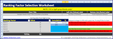
Get a quick and easy Pareto Chart Template to help you and your team get the most our of your improvement effort.
0 Comments