| 🔍 > Lean Terms Directory |
7 Basic Tools of Quality / 7 QC Tools
The “7 Basic Tools of Quality“ (or 7 QC Tools) is a set of relatively simple data analysis tools used to support continuous improvement efforts, specifically as they relate to quality.
These tools are fairly straightforward in that they don’t require sophisticated statistics to use though control charts do border on being too complex for the typical user to develop.
The 7 Basic Tools of Quality are:
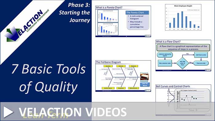
- Cause and Effect Diagram (or Ishikawa Diagram or Fishbone Diagram)
- Control Chart
- Pareto Chart
- Scatter Diagram
- Histogram
- Check Sheet
- Flow Chart
Note that there is some disagreement in the quality community between flow charts and stratification for the last tool. We have included flow charts for two reasons. (1) It is more commonly used and understood that stratification. (2) Stratification is frequently used in conjunction with other tools.
 Watch Our 7 Basic Tools of Quality Video

This grouping of 7 quality control tools is often credited to Dr. Kaoru Ishikawa. While it is clear that he used them, it is not certain that he specifically packaged them together in this grouping. It seems more likely that Lean historians put this bundle together after the fact. Regardless of the origin, though, this set of tools provides a good starting point for continuous improvement training efforts.
With this set of tools, there are few problems that can’t be adequately analyzed. We recommend that frontline leaders be well-versed in these tools—enough so that they can train and mentor their teams. Production team members, in addition to support staff, should have a working knowledge of the 7 basics tools of quality.
Let’s look at the 7 Basic Tools of Quality in more detail.
- Cause and Effect Diagram (Ishikawa Diagram / Fishbone Diagram): The cause and effect diagram gives a graphical arrangement to the potential causes of a problem (effect). This arrangement helps both with brainstorming and with understanding areas of opportunity.
- Control Chart: Control charts are fairly sophisticated run charts that add in limits of statistical variation. This helps teams separate normal, random fluctuations built into a system from special causes that spike the output.
- Pareto Chart: A Pareto Chart takes advantage of the 80/20 rule to visually show the categories with the largest impact on a problem.
- Scatter Diagram: A scatter diagram shows the relationship between two factors. The visual nature of the chart makes patterns jump out.
- Histogram: A histogram is a type of bar chart that shows data in equal ‘buckets.’ This let the user see the distribution of data.
- Check Sheet: Check sheets provide a way to collect and tally data. The individual collecting data simply makes a mark in the appropriate box as a data event is tallied. Check sheets are commonly set up as a grid, allowing for two factors to be recorded at once. For example, the type of defect might be across the top and the workstation the problem was identified in might be on the vertical column. Check sheets are also commonly organized by time or date.
- Flow Chart: A flow chart is a visual representation of the path an entity takes through a process. This ‘entity’ could be a person, product or information.
1 Comment
Gaurav Pant · August 12, 2019 at 7:28 am
Very Nice and informative with good presentation.